Data update on:
When you first read about the theory behind pair trading, its really difficult to hold the urge to start trading the strategy right away. Why so? One, the strategy is simple to understand and execute, two, it's market neutral and three, it's inherently risk bound. Sounds too good to be true, right :-). If so then why not every one is into pair trading and why it has historically been tagged as the tool monopolized by institutional investors and proprietary trading desks. Why can't retail investors make inroads into the nobility? Let's try to find out while simultaneously trying to punch a hole in the aristocratic silo.
बहुत हुआ सम्मान - Let's Democratize Pair Trading
To begin with, let's quickly go through the concept of pair trading.
Pair Trading is a direct way to profit from relative performance of two stocks by simply predicting which of the two will perform better in short term.
It is based on the principal of Statistical Arbitrage. The best part of Pair Trading is – “you do not need to worry about the stock price direction which may go either up or down”. If you choose the pairs smartly, you can benefit in both up trending and down trending market as what matters is the relative performance of the stock pair and not the direction of movement.
Even though it sounds simple (a three step process, 1. Identify two stocks which move similarly, 2. Monitor the stock price movement and 3. Execute the trade), still Pair Trading is tough and elusive for retail investors. The key challenge lies in identifying ideal pairs to trade. The math's involved is notoriously difficult to understand. Additionally, there are no tools to do these calculations at scale and on daily basis (unless you are very proficient at programming and can DIY). Having said that, challenges do not end here. Even after you have identified ideal pairs, you need to work on position sizing and timing. As there is enough material available online, I would leave it to you to explore the math behind pair trading and would rather focus on providing data and tools so as to enable you to identify ideal pairs, figure out position sizing, pin point opportune time to enter the trade and define the right stop loss for the trade.
Step 1 - How to identify right pairs to trade?
The thumb rule to follow while trying to choose good pairs is:
Look for stocks from the same sector, having similar business model and comparable market cap as they have the highest chance to be cointegrated over a longer time horizon
Being from same sector and of comparable size kind of immunes the pair from unexpected news flow regarding the sector as a whole. Be it negative news or positive, both stocks will hopefully move in the same direction - and this is what is desired in pair trade. Now before I explain cointegration, here is the sector wise distribution of FnO stocks along with number of stocks in each sector or industry. I will encourage you to quickly browse through it and try to spot some pairs from same sector and comparable market cap which you might prefer to trade.
Eyeballing does help, but we do need further validation for the pairs we have selected. Now statistical test for cointegration is what offers that mathematical validation. Ideally speaking, for pair trade strategy to be profitable, the pairs must be highly cointegrated. So what does being cointegrated mean? Here is a simple definition:
In layman terms, a pair of stocks are cointegrated if they move together and the difference between the two remains constant
Imagine walking your dog with a leash. No matter how you move or your dog moves, the maximum distance between you and your dog will always be equal to the length of the leash. Similarly, for two perfectly cointegrated stocks, no matter where stock a goes (up or down) it will pull along stock b so as the price difference between the two always remains constant (hope you now understand why pair trading is a market neutral or non directional strategy). But the world is not perfect ;-). So there will be relative mispricing and that's where the pair trading opportunity lies - statistical arbitrage where in you sell the overpriced entity and buy the underpriced one and hold till the mispricing goes away and you pocket the arbitrage profit at the end. Now getting back to cointegration and identifying cointegrated pairs. Mathematically speaking, we establish cointegration using Augmented dickey fuller test aka ADF test. But as I said earlier, we will avoid the maths, however just in case you want to explore here is a nice tutorial on Pair Trading that covers the whole concept. So let's jump directly to ADF test results for some of the famous pairs users have been searching on our platform:
You can infer the test results quickly by analysing columns Adf Test Stats, Adf P Value and Critical Value in the table above. Statistically speaking, Adf Test Stats < Critical Value suggests that the pairs are cointegrated and can be good candidates for pair trading. Adf P value is basically the probability of them not being cointegrated. So lesser the P value the better cointegrated pairs are. For ease of identifying highly cointegrated pairs, table is already sorted from lowest Adf Test Stats to highest. So highly cointegrated pairs are available at top.
अरे बबुआ पर हम कैसे मान लें की ये कैलकुलेशन सही है?
Do not believe what you don't see for yourself ;-). Now to cross verify the validity of cointegrated pairs, I will encourage you to click on the table rows. It will load few charts and tables which will help in validating what we have inferred just now. If you are doing it for the first time then click on the first row of the table as in this case the difference will be more forthright. When you click on the first row, 4 charts will load. Let's cover them one by one.
The story on Chart 1 - Price Plot of Stock A and Stock B
Chart 1 is a visual representation of historical price comparison over last one year for Stock A and Stock B. By looking at the chart, we can very well establish if there is a relationship between the two stock prices. Do they move together? Whenever price of first goes up, price of second follows and vice versa or not. If the high level answer is - yes they seem to move together then this is the first sign of being cointegrated.
ज्ञानियों ने कहा है: पति (Stock A) और पत्नि (Stock B) ये संसार (Pair Trading) की गाड़ी के दो पहिये है, इसमें का एक भी पहिया बिगड़ गया तो संसार (Pair Trading) की गाड़ी चल नहीं सकती.
The story on Chart 2 - Plot of percentage difference in price of Stock A and Stock B ((Price A - Price B)*100/Price B)
Time to move to Chart 2, which is a plot of Percentage Stock Price Difference (blue line) calculated as ((Price A - Price B)*100/Price B) and Mean of Percentage Stock Price Difference (the red line). Ideally speaking, if you are looking at a nice cointegrated pair then the blue line (the percentage price difference line) will show a tendency to kiss the red line (mean line) and should cross it multiple times in last one year. The more the number of crossovers the better it is. This proves that stock price difference is mean reverting and hence they are cointegrated and can be added to the watch list as ideal pairs to trade.
While establishing mean reversion, it's mandatory that two line cross each other multiple times in a given timeframe. Be careful about the word “multiple”.
Now repeat the same process by clicking on last row of the table where Adf Test Stats and Adf P Value is the highest. You will surely have contrasting observations this time on the 2 charts. Relatively speaking, on the first chart prices will not appear to move together plus on the second one blue line will not be crossing the red line more often signifying no mean reversion.
If we are on the same page, give a pat on your back. You have covered a great distance. So let's continue our quest of profitable pair trade.
The story on Table 3 - Pair Spread Statistics
As we have identified ideal pairs, the next step is execution i.e. monitoring, spotting and entering profitable pair trading opportunity. You must have already guessed that the answer is hidden in the 3rd table that appears on clicking on the rows i.e. Pair Spread Statistics. By spread we mean the percentage difference between the two prices - blue line on chart 2. In order to establish whether a pair trade opportunity exists or not, it is necessary to analyse the mean and standard deviation of the spread. How to read it? Here is an example. Look at the chart 2 and spread stats for Stock A and Stock B below:
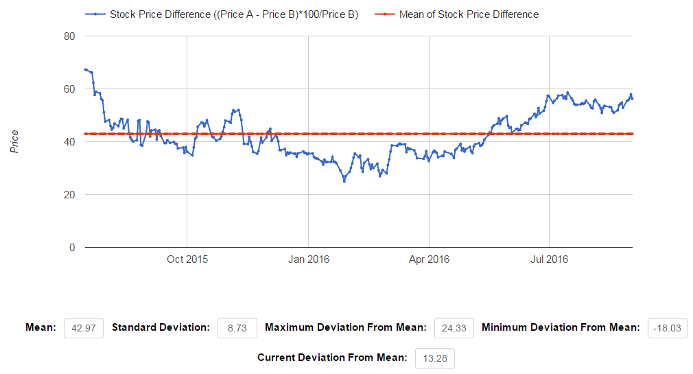
Let’s find out the meaning of individual values one by one.
- Mean – Here the Mean of % stock price difference is 42.97 (plotted as red line in Chart 2). Generally speaking this means, on average Stock A trades 43% higher than Stock B.
- Standard Deviation – The value of standard deviation of % stock price difference is 8.73. Generally speaking this means, the stock price of Stock A trades in the range of 51.7% (42.97+8.73) to 36.24% (42.97-8.73) above Stock B price.
- Maximum Deviation From Mean – The value is 24.33, which means Stock A has traded at maximum premium of 67.3% (42.97+24.33) to Stock B in past one year. It is the highest point on blue line in Chart 2
- Minimum Deviation From Mean – The value is -18.03, which means Stock A has traded at minimum premium of 24.94% (42.97-18.03) to Stock B in last one year. This is the lowest point on blue line in Chart 2.
- Current Deviation From Mean – The value is 13.28, which means Stock A is currently trading at a premium of 56.25% to Stock B. This is the last point on blue line in Chart 2, i.e. most recent value on blue line.
ये कैसे हो गया? तुम तो बोले थे नो मैथ्स :-(
If it's too confusing then let me cut the extra flab.
The Secret Sauce – The best profitable pair trade opportunity arises where the Current Deviation From Mean is either near Maximum Deviation From Mean or Minimum Deviation From Mean.
In other words, Current Deviation From Mean should be significantly larger or smaller than the Standard Deviation. How large or small depends on your risk appetite, however the absolute best is the point of minimum and maximum divergence - the highest and the lowest point on blue line in Chart 2. So look for stock pairs for which current deviation is near historical max or min deviation values.
Let me save you the hard work.
Here is the list of pairs which are trading near maximum deviation and minimum deviation of last one year. Click on the rows and you will get to see the detailed price and deviation charts. You can also sort the data by clicking on the column headers.
Now let's say after careful analysis you spotted an ideal pair whose spread is currently at tipping point - i.e. near historical high or low. So if you want to open a pair trade, the next logical question is which one to buy and which one to sell. In other words which of the two stocks is undervalued and which one is overvalued? You can seek this answer from Chart 2 and spread statistics. The rule of thumb is:
- If the current deviation from mean is near historical minimum (below mean line) then stock with high price is undervalued (buy it) and stock with lower price is overvalued (sell it)
- If the current deviation from mean is near historical maximum (above mean line) then stock with high price is overvalued (sell it) and stock with lower price is undervalued (buy it)
So far so good. Now you know which one to buy and which one to sell.
But what about quantity - position sizing?
For deciding the quantity of buy and sell, you will have to refer back to table Adf Test Stats, the first table above.
The 3rd column i.e. hedge ratio helps in deciding the relative quantity of buy and sell.
For example if the Hedge Ratio is 3 then for each unit of high priced stock you will have to buy or sell 3 unit of the low priced stock.
In Indian FnO market the lot size of each stock is kept round 5 Lakh, however due to price movement over a period of time the value of one lot could be much lower or higher. So to cover the deficit, you might have to do some buying in cash market to align the position as per the hedge ratio. Let me remind you that in cash market only buying is allowed and not short selling, so you can only cover the deficit on only those pair trades where you can do so by buying in the cash market.
In summary - the easiest way to determine position size is to set a fixed lot size for each side of the trade, say 1 lot to buy and 1 lot to sell. Then calculate the difference in value of the two lots based on the current future price. To cover the difference, do the buying in cash so as at the end you have same value for both the positions. Refer to this article for an example on position sizing.
If position sizing is clear then let's talk about theoretically most valuable and practically most ignored part of trading i.e. Stop Loss.
Only one line - Do not loose more than 2% of the capital required to enter the strategy.
If both legs of the trade goes against you (it happens very often) and you are loosing 2% of the initial capital, close both the positions simultaneously and start looking for another opportunity. In trading, tomorrow always comes, only most of the time you are not there to welcome it ;-).
The story on Chart 4 - Adf Test Stats Historical Trend
But what's the 4th chart telling?
Allow me to explain as this is a crucial chart.
This chart kind of helps pin point pairs where existing cointegration relationship is about to break or new cointegration relationship is about to form.
Does crossover rings a bell?
Chart 4 plots the trend of Adf Test Stats along with the critical value of the pair of interest.
It gives you a sense of how tightly cointegrated the pair has been historically. In an ideal scenario, for a perfectly cointegrated pair, Adf Test Stats (blue line) should always be less than the Critical Value at 95% confidence interval (orange line).
An up trending ADF Test Stats line crossing over the Critical Value line from below clearly indicates that the cointegration is in danger and such pairs should be dropped from watchlist.
Similarly, a down trending Adf Test Stats line crossing over the Critical Value line from top indicates that the pair is becoming cointegrated and should be added to the watchlist.
I think I have done enough talking and will leave you here to spend some time and internalize what we have discussed till now. Just in case you don't want to be restricted to our list and feel like exploring other pairs, you can do so by choosing pairs in the drop downs below:
*Note - Please be patient as chart takes approximately 5 sec to load. Please click on Pair Trade Analysis button again after 5 sec if empty chart is loaded.
If you are totally new to the concept of pair trading then here are some basic concepts to get started:
What is pair Trading?
Pair Trading is a direct way to profit from relative performance of two stocks by simply predicting which of the two will perform better in short term. It is based on the principal of Statistical Arbitrage The best part of Pair Trading is – “you do not need to worry about the stock price direction which may go either up or down”. If you choose the pairs smartly, you can benefit in both up trending and down trending market as what matters is the relative performance of the stock pair and not the direction of movement.
Key benefits of Pair Trading
- Market Neutral - Pair trading is Market Neutral, meaning that you can make money in both up trending and down trending market.
- Low Risk - As Pair Trading is based on Statistical Arbitrage principal, there is an inherent floor for the maximum loss you might make. Generally speaking the losses will not break your back and you can always bounce back.
- Liquid and Flexible - Pair Trading gives you complete flexibility and is highly liquid i.e. you can enter or exit your position at any time to book profit or cut the losses.
Key concerns of Pair Trading
- Maximum profit is caped – Similar to the maximum losses, the maximum profit is also caped in this strategy. The bottom line is single pair trade (of course with reasonable lot size) cannot make you extremely rich or extremely poor, however a series of pair trades can.
- High transaction cost - As pair trades normally involve 4 transactions (2 while opening the position and 2 while booking profit or cutting losses) to complete, it’s relatively expensive when we talk about brokerage and other transaction fees. However, high costs should not be a deterrent as nothing comes for free and here we are talking about profit.
Basic steps for successful Pair Trading
Pair Trading is basically a 3 step process:
- Identify two stocks which move similarly – A relative comparison of stock price movement over at least one year can give you a fair idea about co-integrated price movement. By co-integrated price movement we mean that the difference of stock price remains constant over a period of time and the deviation in stock price difference is mean-reverting. You guessed it right – The pair trade opportunity arises when there is a significant deviation in stock price differential from the mean. To know more about co-integrated stock pairs please go here.
- Monitor the stock price movement – You have to basically look for significant deviation in difference of price of the stock pair identified in step 1 from mean difference. Confused? Don’t worry. Things will be clear while you go through the example above again.
- Execute the trade – Once you have spotted a significant short term deviation from mean price differential, you have to Sell high priced stock and Buy low priced stock.
Note* - The data on this page comes from what we have in our database and is not complete plus there might be inaccuracy in the numbers shown in the tables and charts above. So use this data for analysis purpose only and do not treat it as any recommendation to trade or invest. Also do a second level check for data accuracy from direct sources like NSE and BSE websites.